


Glancing Signalis (Part 1) - Immersion from across the room
ie. How the lack of HUD elements help overcome the weaknesses an isometric perspectives has in creating horror.


Signalis is an exceptionally beautiful game. It is a classic survival horror game but with a great modern juice to it. There are many components of the game from the design, to the storytelling, to general UI, which is what I will be diving into this post, that give the game an enjoyable experience. The art direction is tight, coherent and functional to what it serves - the story, and immersion.
The game itself shares many similarities to other survival horrors games such as the resident evil series including the resource management, backtracking and numerous puzzles. A tried and true method but there is no shame in re-using much of the formula, for the game certainly has done a lot of right doing so.
Signalis was a thrill to play through and these next series of post can be considered a love letter of sort to it.
To begin this post, I would first like to commemorate the one of the game’s many strengths - it’s ability to pull you into its immersion.
SPOILER WARNING
The game will feature screenshots from parts of the game. I believe exposure would not ruin any part of the game without context but nevertheless the warning will be valuable.
I will also not touch as much on the narrative portion of the game in this dive but I certainly have a lot to say about it regardless.
SPOILER WARNING
Cameras and Immersion in Horror Games
Immersion in horror games including Signalis is pivotal to experience the horror itself. In game design, the perspective at which the game takes place from is an important consideration from the get-go. On the surface, it defines the genre. On paper, it defines the mechanics. On screen, it defines the emotions.
It remains to be said that the game design will also vary depending on the kind of horror the developer wishes to explore as the genre itself has many subgenres such as psychological horror, body horror (gore) or my personal favourite, lovecraftian horror.
Contemporary horror game design most commonly feature first-person camera or over-the-shoulder third person camera that puts the player close to the action, or even embody the protagonist itself.
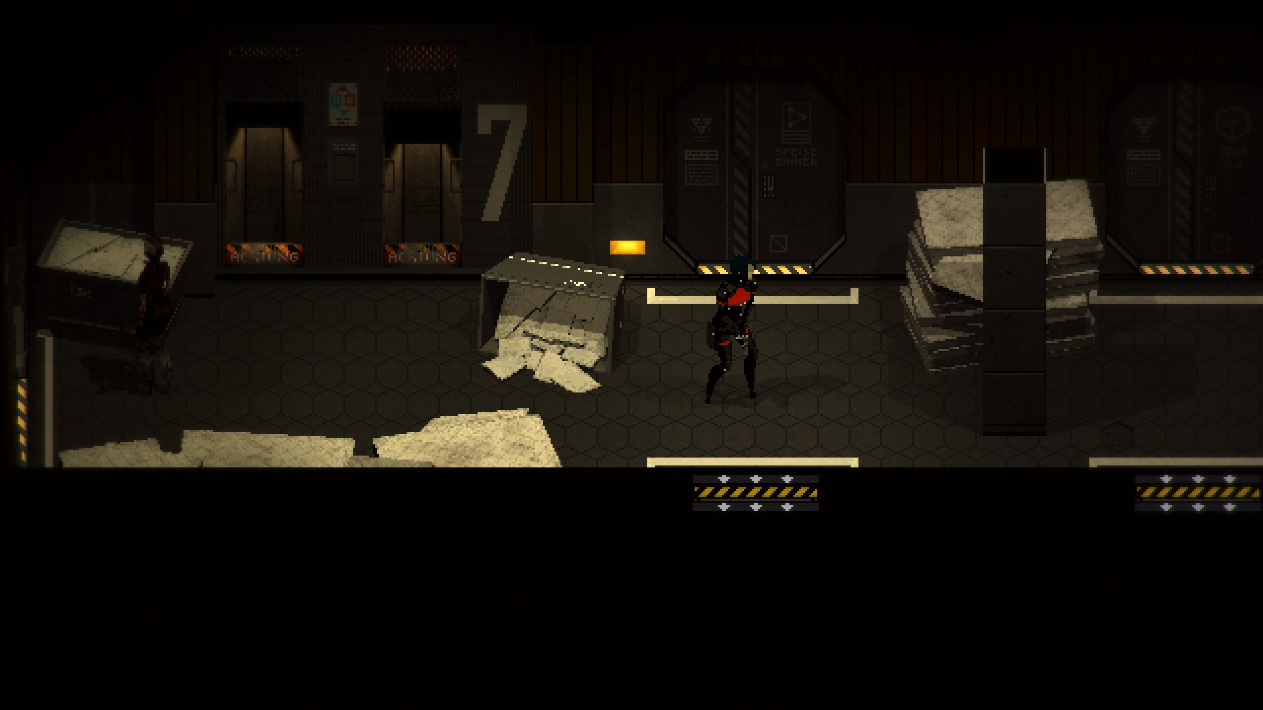
This is where Signalis puts itself in a unique position in how they embrace the horror by. The game is positioned as an isometric perspective which pulls the player relatively further away from the protagonist (and the action) than usual. This particular design decision prompts me to begin looking a bit deeper into Signalis. That and because it’s pretty good too.
Throughout this series of review, I will be looking at several aspects of Signalis in their game design and try to peek into why they do each things and get a general look into different aspects of the game. Each aspect naturally bleeds into other systems in how they affect one another so where possible, I will try to gleam and make light of that.
Without further udo, this is Glancing Signalis - peeking into the game design of the classic survival horror.
Stillness is Loud: Empty HUD Designs.
From the get go, Signalis understands experience. Signalis shows a masterful design in UI presentation to present elements that appear as if they are in the game world itself, or display during gameplay scenarios where real-time actions take place. In technical jargon, these would have been called Diegetic or Spatial UI.
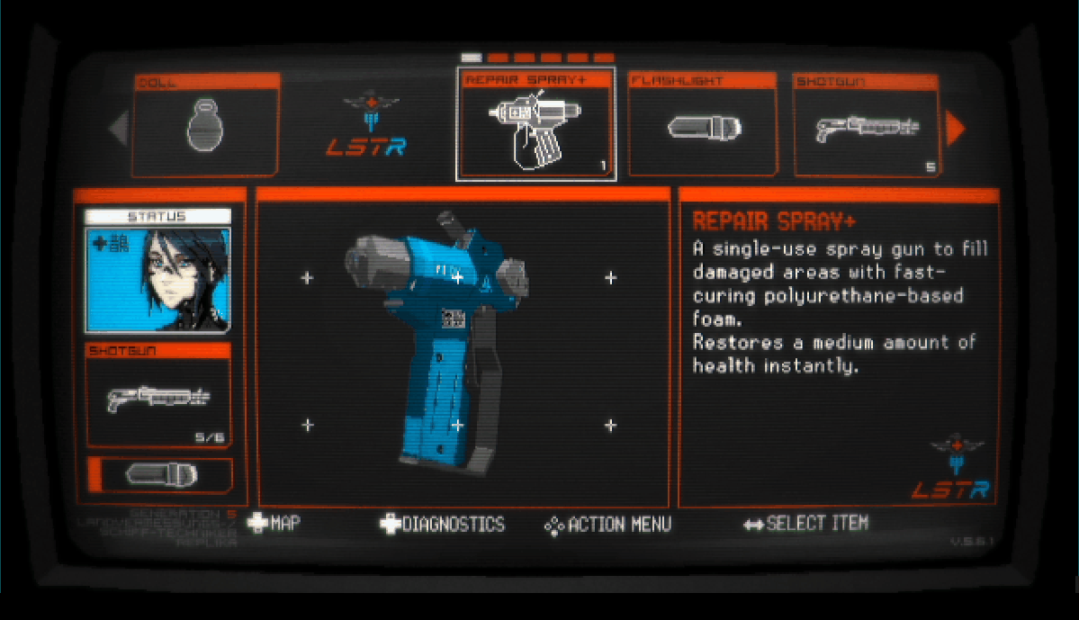
Outside of real-time gameplay scenarios, more traditional UI elements take over to represent the key gameplay mechanics such as the inventory management. These are typically referred to Non-Diegetic UI. That said, even these UI elements have been conceptualised well to feel as if they are snug fit right into the game world. Taking into the consideration that the player controls an android essentially, the inventory/systems UI are designed accordingly to reflect that.
Overall, the general UI design is masterfully executed and fit to reflect the world the game inhabits, and showcases the perspective the protagonist takes to help the player immerse and build empathy from behind the screen. In addition, its presentation in during real-time gameplay (exploration and action) or out of it (inventory management and etc.) helps create flow and maintain the players’ focus in the game without distractions.
In game design, the perspective at which the game takes place from is an important consideration from the get-go. On the surface, it defines the genre. On paper, it defines the mechanics. On screen, it defines the emotions.
Achieving this masterful work in UI and HUD design complements Signalis gameplay design really well in a few ways:
Immersion (into Horror)
Supports the Transitions, Storytelling, Flow and Puzzle Sections
Immersion into Horror.
The game develops this interesting pacing where the beginning of each level (and by extension, each story chapter) has a high level of suspense, thrill and strong horror elements supported by the lack of information in terms of map knowledge and enemy knowledge and having to traverse each room slowly.
In the absense of a first-person perspective, or a close over-the-shoulder 3rd person perspective, the lack of distracting HUD in the main gameplay supports pulling the player into the game.
This is a common design element in many horror games but it still goes to show the importance of it to highlight what exactly makes horror games so compelling. Modern non-horror games also go out their way to incorporate dynamically hiding UIs such as in Witcher 3, Breath of the Wild or Horizon Zero Dawn, for this same reason of increasing immersion wherever possible.
Supports Transitions, Storytelling, Flow and Puzzle Sections
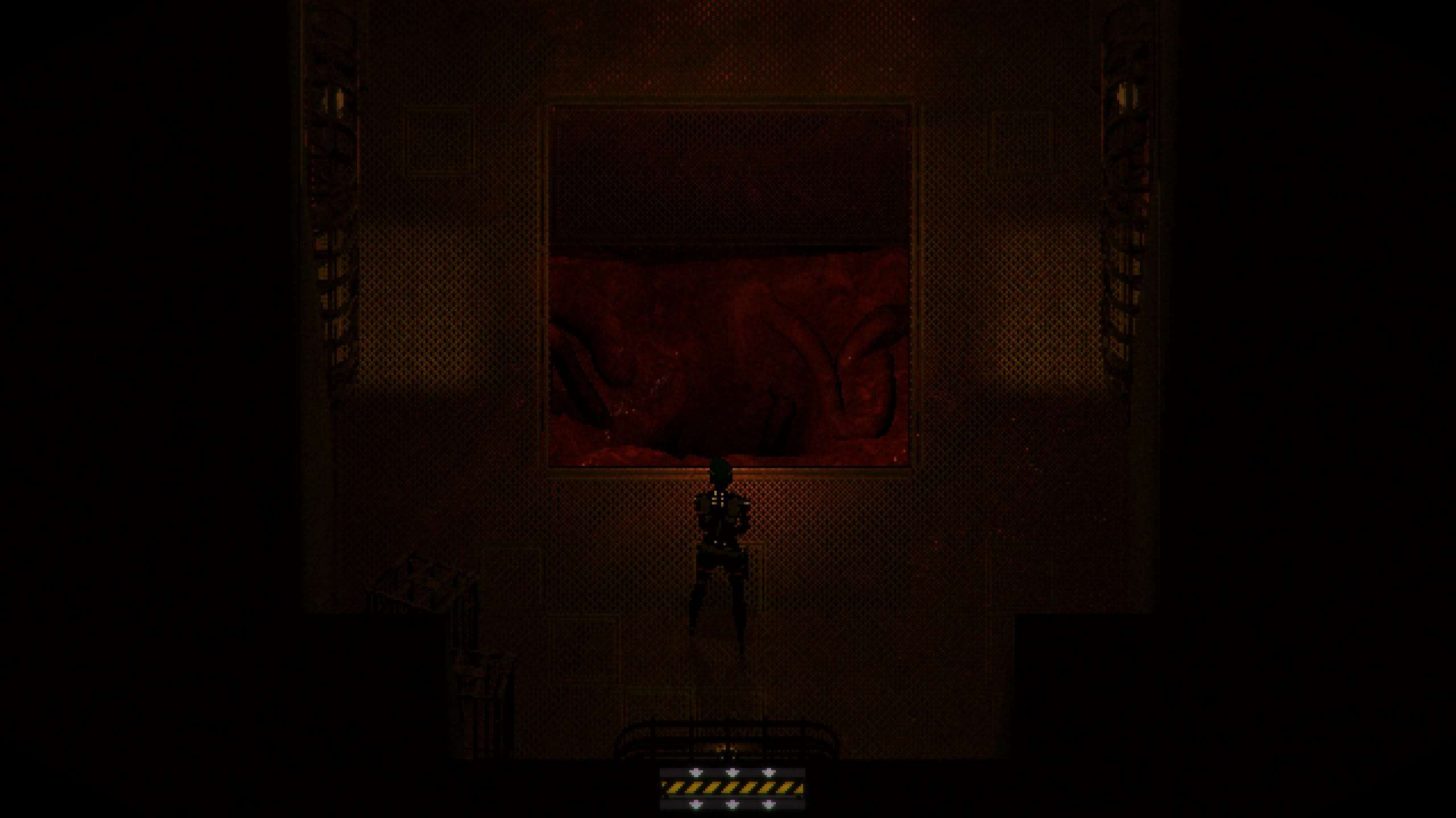
The game also features sections where the game transitions into a 1st person perspective for a particular exploratory section or puzzle section. The lack of a HUD helps this transition become seamless as the HUD would normally anchor a particular perspective.

What Signalis did particularly different than other classic horror games is the deliberate exclusion of needing to navigate the inventory to select key items to interact. Instead, as long as you have the key item in inventory, Signalis basically prompts the item to be used in a simple pop-up dialogue. The game only has a few rare occasions to which the player is required to select an item from
I believe the deliberate lack of a transition to an inventory system is an intentional decision to keep the player focused on the puzzle itself. The player does not need to navigate the inventory to select items to use in a puzzle which creates a cohesive flow from start to finish.
As such, the team’s deliberate philosophy to keep as little UI elements, even in puzzle sections creates a unique sense of immersion and flow that pulls the player into the world and by extension, into the horror.
Next Part
I sincerely applaud the team for their tight art-direction throughout the entire gameplay experience exemplified by their empty-HUD approach. As a game developer myself, I aspire to learn from this and hope to minimise my HUD elements should immersion become an important factor.
Next parts to focus on are some areas that I believe would benefit from revisiting - particularly in the game/story pacing in the gameplay.